TEXT ELEMENT
Posted by 1 1 on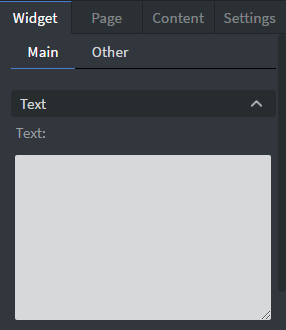 |
In the Text Box you can type the text that you want to display on the canvas. |
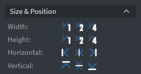 |
In the Size & Position Menu you can select the width, height, and placement of your widget quickly. See more information about: Size&Position. |
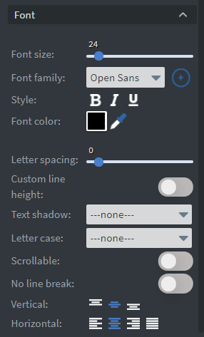 |
In the Font Menu you can set the size, family, style, and the color of the font. You can also set letter spacing and shadow to your widget here. Enabling Scrollable will allow you to scroll through your text in interactive contents. Vertical and Horizontal alignment of the text can be changed in this menu too. No Line Break is useful for data binding by allowing your text to remain on one line and not wrap. See more specified information about: Using font. |
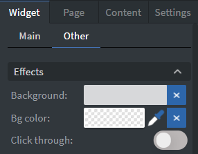 |
In the Effects Menu you can select a background image or color to your widget. Enabling the Click through function allows you to click through the widget and interact with other widgets behind this one. |
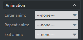 |
In the Animation Menu you can choose the Enter, Repeat, and Exit animations of your widget. See more specified information about: Animation. |
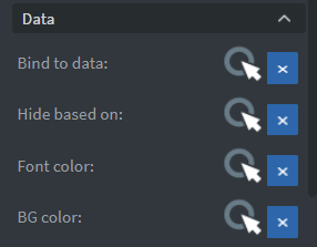 |
You can use the Bind to data tool to select your Datasource. With Hide based on data binder you can give a data from a datasource to the widget. With BG color data binder you can give a background color for the widget from a Datasource. |
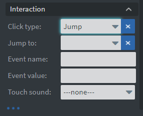 |
In the Interaction Menu you can choose a Click type interaction and Touch sound for your widget. See more specified information about: Interactivity. |