IMAGE ELEMENT
Posted by 1 1 on
The Image widget allows you to add pictures to your content. |
|
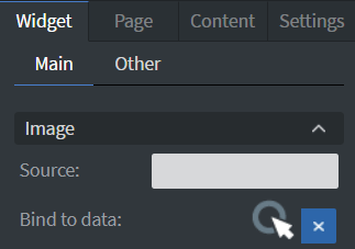 |
Under the Image Menu you can set the source picture of your widget. |
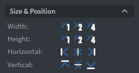 |
In the Size & Position Menu you can select the width, height, and placement of your widget quickly. See more information about: Size&Position. |
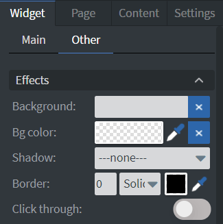 |
In the Other Effects Menu you can select a background image or color to your widget. You can set Shadow and Border here. Enabling the Click through function allows you to click through the widget and interact with other widgets behind this one. |
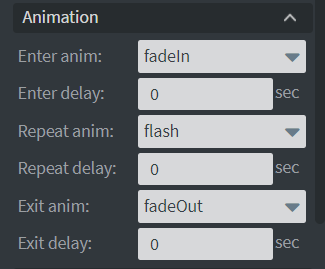 |
In the Animation Menu you can choose Enter, Repeat, and Exit animations of your widget.
|
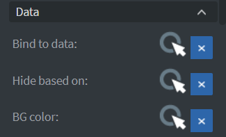 |
You can use the Bind to data tool to select your Datasource.
If the data row of the device and the given data are not the same, the widget will not appear on the device.See more about: Data binding. |
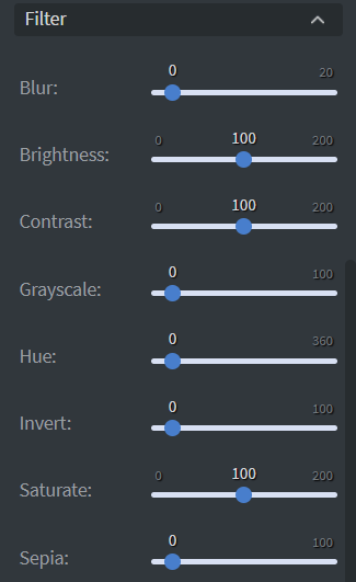 |
The Filter menu allows to modify your image with different types of filters. |
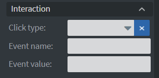 |
In the Interaction Menu you can choose a Click type interaction and Touch sound for your widget.
|