DATA BINDING
Posted by 1 1 onExternal Data Sources
Connecting data sources
You can connect different types of external data sources to our system. Right now, supported types are:
- Json (advised in most cases),
- XML,
- Google Sheets,
- ICal calendars (Google, Apple, etc.),
- NodeJS scripts (uploaded to our system).

Navigate to the “Settings” menu, locate “Datasources” and click “Add new”. You can either create a new Google Sheet or click “Use existing URL” in any other case. URL can be anything that can be accessed from your server (localhost, internal network, www, …) and is or returns a supported type. For example, your data source URL can be something like this:
https://www.example.com/myDatasource.JSON
In this case, the “Type” will be JSON. Set the “Refresh” time according to how often your data usually changes and how quickly you need your contents to show the change. If everything is set up correctly, after clicking on the “Preview” button, you will see your data.

Note for system administrators: You can also access and datasources from the administrator menu. You can also set the minimum refresh time that your customers are allowed to set in the system settings menu.
Using a Google Sheet in a content
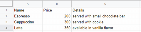
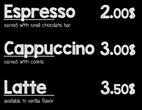
Google Sheets are limited but easier to use. Type the column names into the first row and details of entities below them row by row. For example, if you are creating a cafe menu your column names can be Name, Price, and Details and your rows will contain the different available coffees.
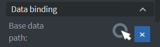
Create and open a new content then locate the “Content” section in the left-hand menu. Click on the “Base data path” button.
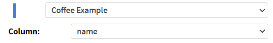
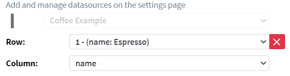
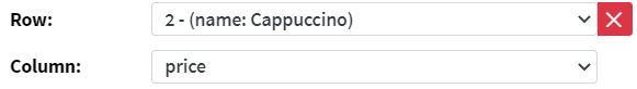
Select your data source and the column with a unique identifier. In this case, this will be Name.
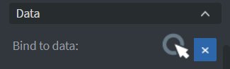
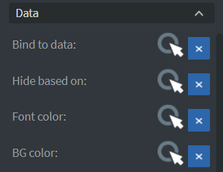
Add a “Text” widget and instead of typing in your text, select it by clicking on the appearing widget and locate the “Other” tab in the left-hand menu. Click on “Bind to data”. You can also access this menu by holding Shift and double clicking on your text widget.

Choose one of your fields, in this case, we chose the Name field from the first row. Because we set up a base data source first, we only need to choose the “Row” and the “Column”.
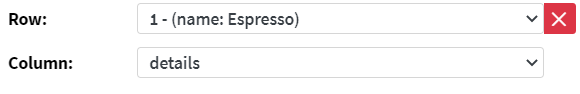
Now we can add two more text widget for the price and the details.
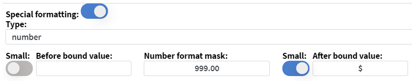
The price is tricky because we have 300 in our data sheet, but we want to display $3.00. We can achieve this by turning on “Special formatting” at the bottom of this pop-up window.
Number format mask reads both the input and mask starting from the last character. All the 9’s and 0’s will be replaced by the corresponding digit. Any other character in the mask will be added to the indicated position. 0’s will be displayed in a smaller size. If the input is longer than the mask, the first digit of the mask will be repeated. “9.00” will display any price with big numbers, a dot and the last two digits as smaller numbers, same as “9999999.00” would. A phone number can be displayed with a mask such as +99/99 999 99-99.
Also note that choosing the 1st row means whatever is in the 1st row will be shown even though there is a hint (name: Espresso) next to it for easier setup. Hence, if you add Latte macchiato instead of Espresso into your first row, the content will show that instead. Or, if you change the price of Espresso the content will reflect that.
You can apply any text formatting you could to a normal “Text” widget using the right-hand menu.

You can copy and paste everything and choose different rows. When a widget has a bound data source, double click will automatically open the data binding popup.
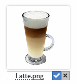
You can also bind images. For this to work you need to upload an image with the exact same name as one of your data fields (or rename it after upload). You can open the “File” popup by double clicking on an “Image” widget or pressing Alt+M.

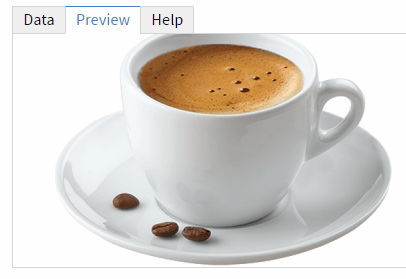
Add an “Image” widget and open the “Bind to data” popup. We can choose 1/name for the image, the same we chose for the first text widget. On the “Data” tab, we will see the same “Cappuccino” text but if we click on “Preview”, the image will appear.
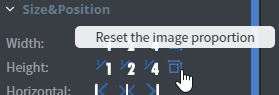
If your image’s proportions are distorted, use the “Reset image proportions” in the left-hand menu.
You can use Google Sheets with any other widget discussed later in this documentation.
Using Json/XML data sources in contents
(Please read the above Google Sheet section first!)
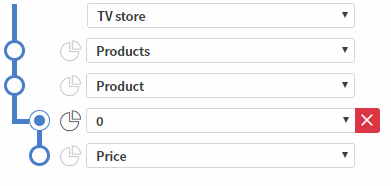
While Google Sheets are always a fixed depth (a table), custom data sources can be deeper. For example, an electronics store’s database will have products (let’s say, TVs) and every TV will have simple data fields such as name, price, previous price, number of HDMI inputs, etc. Each of them can also have a table of all the different features as key-value pairs or even a similar array.
Create a “New content”. You can either use the demo data source provided with this guide (TODO) or your own data source. In the “Page” section, click on “Base data path”. This time, the popup will be a bit different.
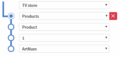
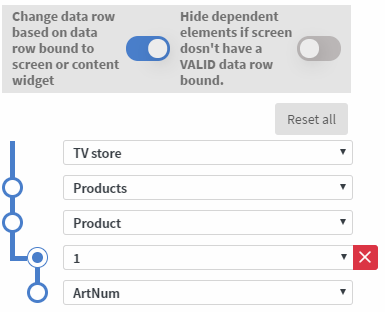
First, we need to select our unique identifier. For this store, it will be the ArtNum field.
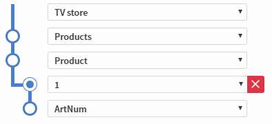
Now we can adjust our “Pivot point”. It must be on the level where our main entities are (e.g. products, employees, meetings, etc). In this case, these are the products which we store in an array. Every product has an ArtNum, Name, Price, etc. We need to put the pivot point to the level “above” the recurrent part. As a rule of thumb, if we have an array of the things we want to display, the “Pivot point” will be at the array’s level.
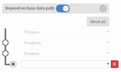
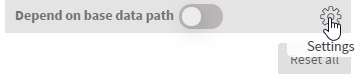
Add a “Text” widget and open the “Bind data source” pop-up. The path selection block will be half filled. If we need to bind this widget to a different data source (or a different part of the same one), uncheck “Depends on base data path”. In any other case, it is advised to keep your widgets dependent.
Choose a field to be displayed in the “Text” widget.
Try it out
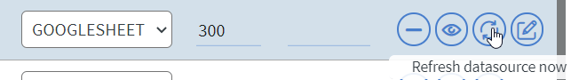
Open the preview of the content in your browser or send it to a media player. Change something in your data source that is currently visible on your screen. If we change the price of Latte to 385 from 350, the next time the data source is refreshed, it will automatically update in your content as well. This next time depends on the refresh time set on the “Settings” menu. You can also click the refresh button next to your data source on “Settings”. This approach can be useful if your data rarely changes but you want the changes to apply quickly. (E.g. weekly menu in a restaurant.)
Depends on base
If you’ve followed this guide, you always have your “Base data path” set up first and all your bound widgets automatically have “Depends on base” checked. This is usually advised to keep this way. In case you need to bind a widget to a different data source (or a different part of the same one), uncheck “Depends on base data path”. You can always mass-connect all your eligible widgets later if you open the “Base data path” window. You can also access this from any data binding window.
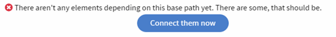
After clicking the “Connect them now” button, a new status message will appear.

“Base data path” makes it easier to bind multiple widgets to similar data paths quickly. It also makes it possible to export/import a content between different servers. After importing the content, add the data source on the “Settings” page, then set this as the “Base data path”. It can also help if you need to change the outside structure of your data source but the parts at the level and below the “Pivot point” stay the same. Just change your data source and adjust the “Base data path”, all dependent widgets will automatically use the new base.
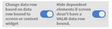
Change based on data row
“Depends on base” is also a prerequisite for the “Change… based on data row” feature. Turn on “Change data row based on data row bound to screen or content widget”, also have all your widgets set to dependent.
Optional step: If you would like to test your content on your computer before sending it to a media player, you can. Open the content preview in your browser (advised: Google Chrome). Open Development Tools Console (press F12), find the Console tab and type document.cookie = “dataRowId=MY_UNIQUE_ID“; replace MY_UNIQUE_ID with the value of a different field in your base column. In this example, the ArtNum of a different product would work. Refresh the browser.
Bind data row
After your content has “Change based on…” and some dependent widgets, it is ready to be assigned to multiple screens and used for digital labeling. Navigate to the “Home” menu and assign your content to some screens, either by dragging it to different screens, a screen group, or by using the right click menu on screens.
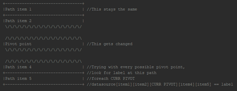
When a screen with a “Bound data row” starts playing a content, it will try to find the given “Data row label”, using the “Base data path”. Let’s call anything above the “Pivot point” the “base” and anything below the “Pivot point” the “label position”.
The software will check every possible path that is “base” + a possible pivot point + “label position”.
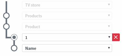
For example, if we have Products/Product/1/Name as our “Base path” and 3 products (1,2,3) in our data source, the following fields will be checked:
Products/Product/1/Name, Products/Product/2/Name, Products/Product/3/Name
If any of these equals the given “Data row” (let’s stay it was “Big TV” and it equals Products/Product/2/Name in this case), for each of the dependent widgets, the “Pivot point” will be changed (in this case, to 2).
This means you can create one content for all your products and send them to different screens. Bind their unique identifier to each individual screen and they will display the data of the different products.
Bind data source
Like “Bind data row”, you can access this feature on the “Home” menu by right clicking on a screen. In this case, it also works on screen groups.
For this to work, the original base data source and the alternate one must have the same structure. They can have different data connected to the same unique identifiers or even different unique identifiers, as long as their structure stays the same. (Imagine having two tables with the same headers but different data rows.)
“Bind data source” and “Bind data row” can work together, the “Data row” will be searched for in the new data source.
Data row with content widgets
You can also change the “Data row” by using a “Content” or “Contents” widget.
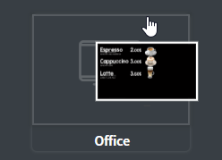
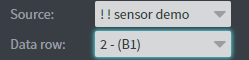
After selecting a content that has a “Base data path”, a “Data row” selector will appear. If the target content has “Change based on…” set up, the currently selected label (B1 on the following image) will be used. If not, the selected index (2 in this case) will be used.
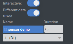
For “Contents” widget, “Different data rows” has to be checked. The “Data row” selectors will appear for all contents with a “Base data path”.
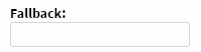
Fallback
You can specify a fallback value for most elements. The type depends on the widget.
If the value in the bound field is null, empty string (“”), 0, false or undefined, the fallback value will be used instead.
Hide some/all bound elements conditionally
You can hide any element if a selected field is empty (null, empty string, 0, false or undefined), by using the “Hide based on” button. It can be found somewhere on the “Other” tab of all widgets, however, some widgets have it inside the “More…” options at the bottom of the “Other” tab.


The main use of this feature is to hide unnecessary labels if their respective data is not available. For example, original price label should be hidden if the product does not have an original price.
Tip: A nice effect can be achieved by having two copies of the same image on top of each other. The below one should have its opacity turned down or grayscale turned up. The above one should have “Hide based on”. If the selected field has some not-empty value, the colorful image will be shown. If not, the below, tuned down image will be visible instead. Works well with digital labeling for showcasing available features.
In case you use “Bound data row”, there is a high chance you do not want your screens to display weird data when the “Bound row” cannot be found for any reason. It is advised to turn on “Hide dependent elements if screen doesn’t have a VALID data row bound.” option in the “Base data path” before using the content live with “Change based on…” turned on.
Other bindable widgets
Many other elements can also be bound to data. They all work with “Bind data row” and “Bind data source” as well, hence can be used both in normal and digital labeling contents.
These are the widgets that can use data as their source: “Text”, “Image”, “Scroll”, “Gallery”, “Carousel”, “Video”, “QR code”, “Cool text”, “Pieces”.
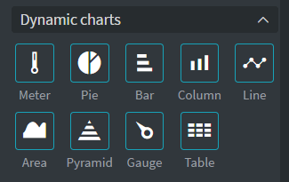
Charts
If you have any data that could be represented by a chart, you can choose from these types. Right now, they can only display one dataset per widget. Later in the future it will be possible to show multiple lines in a “Line” widget or add an aggregated “Column” diagram, etc.
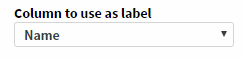
Meter and Gauge are used to display single numeric data. Others display a dataset.
Next to the “Pivot point”, a “Chart level” will also need to be selected. This can be the same or different from the “Pivot point”. In both cases, the “Column to use as label” field will become available. A preview of the selected data will also appear.
Table
“Table” widgets work similar to chart widgets. You will need to select the “Table level” next to the “Pivot point”. It can be the same or different.

Possible columns will appear in the bottom. Check the “Visible” checkbox to specify which columns will be displayed.
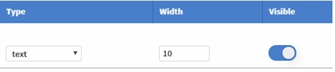
The type can be “text” or “image”. Since 1.5, “checkbox” and “radio button” types are also available.
“Width” is a ratio; all the selected columns’ width values will be added up and the “Table” widget’s width will be divided between them accordingly. For example, if all but one column has a “Width” of 5 and one has 10, the ones with 5 will always have the same width and the single one with 10 will be double of those.
Tip: If the numbers specified for visible columns add up to 100, they will work just as percentages. If they add up to the width of the widget in pixels, they will work just like pixels. If you just need same width columns, just set each to the same number (e.g. 10).
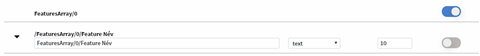
If a possible column has composite data in the above selected instance (on the “Table level”, in this case, 0), turning it to “Visible” will make its children available as possible columns.
By clicking on the small arrow, additional options will appear. For example, “Fallback” value.

It is possible to only display some of the rows. Turn on the “Limit rows” option to see the details.

You can also use “Hide not visible rows’ options” after turning all columns you need to “Visible”.

Note that if the “Pivot point” and the “Table level” are on different levels, it is possible to display tables that change based on bound data row. It can be useful if, for example your products have an array of other data, such as extra features.
If they are on the same level, the displayed data won’t change with the data rows. If combined with “Change based on…”, this approach can still be useful to display a list of, for example, all the available products.
New features in 1.6
Font and background color based on datasource Since v1.6
Normal widgets
On the “Other” tab (for some widgets, in the “More” section), you can find “Data pickers” for “Font color” and “Background color”.
Tip: You can also open the “Background color data picker” for any widget by holding down Shift+Ctrl and double clicking on it.
A “Color data picker” has the same “Path” selection options as any other “Data picker”. At the bottom of the window, you can choose how the data will be turned into color.
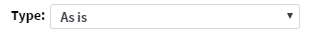
The default value is “As is”, which is useful when your data field already contains a valid color code or color name, such as “#00ff00”, “rgb(255,0,0)”, “rgba(0,0,255,0.5)”, “orange”, etc.

“Append” can be used in case your data field almost contains a valid color code. If your data is “FF0000” you can set the “Before” value to “#” to achieve “#FF0000”. Or if your data field has “255,0,0” and you need the color to be half see-through, you can set “Before” to “rgba(“ and “After” to “,0.5)” to achieve “rgba(255,0,0,0.5)”.
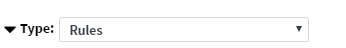

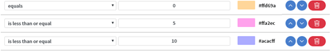
“Rules” are for every other scenario.
After pressing the “Add rule” button, a new row will appear in the table of “Rules”.
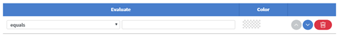
Similarly to “Datasource events”, you can choose an “Evaluation type” and a value to evaluate your data against. If a “Rule” evaluates to be true, the selected color will be set as either background or font color, depending on the “Data picker”. After a match is found, the other “Rules” will be ignored.
If you would like to reuse the same color rules across multiple widgets, you can save it as a “Preset”. Give it a name then press the save icon.

From now on, in this “Content”, you can use this preset for any “Color data picker”.
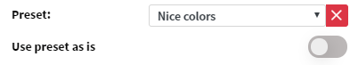
If you also check “Use preset as is”, you won’t be able to edit the rules for that widget, but if you override that “Preset” from any other widget (just save with the same name), all the “Use preset as is” widgets will follow suit.
Tip: If you need to use the same preset across different contents, just “Copy” (ctrl+c) and “Paste” (ctrl+v) a widget from a content with a color rule set and “Save as preset” from the pasted widget’s “Color data picker”.
Table widget
You can also set the background and font color of “Table” cells and the background of table rows. Open a “Table” widget’s normal “Data picker” window and look at the bottom part of it.

You can use the small arrow around the top left corner of the bottom part to collapse the top part of the window. You can also collapse the color picker options, which is useful when you have a lot of “Rules”.

You will see the row background options above the selectable “Columns”. If you open the options for a column with the arrow in the left corner, you will see the cell-wide coloring options.
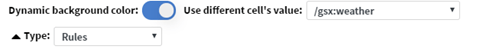
If you turn on the “Dynamic background color” (or “Dynamic font color”), all the options will appear. If you leave the “Use different cell’s value” field empty, the current cell’s value will be used. If you choose any other column, the color will be determined based on the value in that column. You can use “Presets” the same way as with normal widgets.
Dynamic pagination for table widgets Since v1.6
Open the normal “Data picker” for a “Table” widget. Between “Limit rows” and “Row background color”, “Automatic pagination” will appear.

If you turn it on, you can set all of its properties. “Page size” will determine how many rows will be displayed at a time, “Delay” is the time between page changes in seconds. “Show pagination information” will display an indicator showing current page / total pages at the bottom of the table (uses the same formatting options as the header). “Fade animation” will turn on a 2 seconds long animation between table pages.

Popups with data row Since v1.6
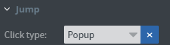

For “Text”, “Image” and “Shape” widgets, on the “Other” property tab, there is a “Jump” block. If as “Click type”, you choose “Popup”, the available targets will be all the “Pages” in the current “Content”. If your current “Content” has “Base data binding” set up, the “Data row” selector will appear.
It will work similarly to “Content” widgets: if the target “Content” (in this case, the current “Content”) has “Change based on…” turned on in “Base data binding”, it will select the data field based on the “Label”,in this example, “Cherry”. Alternatively, if it is turned off, it will select based on the index, in this example 3. If it was a Google Sheet, this would be the 3rd entry.
Content widget improvements
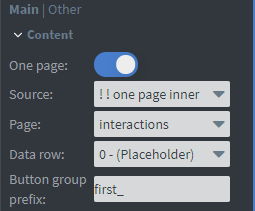
If you turn on the “One page” property for the “Content” widget , a page selector will also appear. Only that one page will be displayed in this widget. Without Slide master or Overlay page, without page changes, etc. On the other hand, it will load faster than the normal “Content” widgets.
You still can select a different data row, if your target content has data binding. You can also add a “Button group prefix“. Read more about it in the Interactive widgets article.